
Case study / Fashion e-commerce
1209 Studios, a custom Shopify fashion experience.
Tathagat Media designed and developed a Shopify storefront for 1209 Studios, a fashion label that releases limited drops. The work focused on brand expression, product discovery and a clear shopping experience.
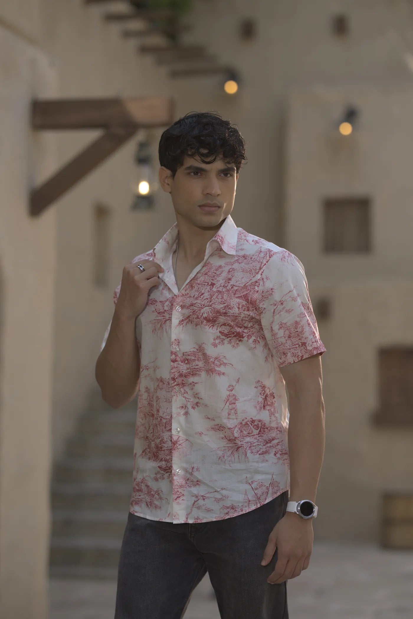
Photography supplied by the brand.
01 / The project
A label that releases limited drops needed a storefront that feels like the brand, and is easy to shop.
The storefront puts the brand first, then makes the clothes easy to find and easy to buy. We designed the experience and built it on Shopify.
Brand expression
Large type, editorial photography and a cream, black and maroon palette carry the label's identity from the first screen.
Product discovery
Six named drops, grouped under Men and Women, make the range simple to browse.
Shopping experience
Clear navigation, a calm product layout and a newsletter sign-up in the footer.
02 / Brand direction
Cultural fluidity.
1209 Studios sits between family traditions and the way cities live now. The storefront carries that idea through editorial photography, an unhurried layout and a restrained palette.
Wear both.
- Cream
- Black
- Maroon
Six drops, one identity
Men
- MehfilEthnic
- VirasatEthnic x Western
- UntamedMetropolitan
Women
- NoorEthnic
- KashishEthnic x Western
- FearlessMetropolitan
03 / What we designed and developed
From storefront to footer, designed as one system.
-
Shopify storefront
A custom storefront for 1209 Studios, built on Shopify.
-
Homepage
An editorial opening, a grid of drops, a brand banner and a newsletter close, in one continuous scroll.
-
Collection structure
Six named drops grouped under Men and Women, each with its own line: Ethnic, Ethnic x Western or Metropolitan.
-
Product-page experience
Image gallery, size selection and product details, designed and prototyped for the product page.
Design prototype -
Responsive layouts
Desktop and mobile layouts, designed so editorial sections stack cleanly on small screens.
Design prototype -
Navigation system
A header with New arrivals, Men, Women, Drops, About, Contact, Search and Bag, where the logo shrinks into place as you scroll.
-
Editorial content sections
Image-led sections with short, confident lines of copy, such as Wear both and Six drops, one identity.
-
Newsletter and footer
A Be first to the next drop sign-up block and a full footer to close the page.
04 / Interaction system
Motion that supports the clothes, not the other way round.
The demonstration below is recreated with plain text and sample copy. It shows how the header and announcement strip behave. Items marked Design prototype come from the design files, not from the live store.
Men
- MehfilEthnic
- VirasatEthnic x Western
- UntamedMetropolitan
Women
- NoorEthnic
- KashishEthnic x Western
- FearlessMetropolitan
Scroll to shrink the wordmark into the header. Men and Women open on hover, focus or click. Recreated here with plain text.
Logo shrink on scroll
On the live homepage, the large opening wordmark scales down into the header as you scroll, and grows back as you return.
Scrolling announcement strip
A slim strip under the header keeps the brand lines and drop names moving.
Men and Women navigation
The design opens each group as a short list of drops on hover or focus.
Design prototypeHorizontal rails
The homepage design lays ranges out in swipeable rows. The photography below uses the same idea.
Design prototypeReduced motion
On this page, scroll and hover movement switch off for visitors who ask their device for reduced motion.
05 / Product range and collection system
Built for a collection, not two samples.
The storefront was designed around six drops, grouped under Men and Women across three worlds: Ethnic, Ethnic x Western and Metropolitan. The tiles below are selected product directions, not the complete catalogue.
Garment types named in the store's size guide
- Kurtas
- Shirts
- Jackets
- Tees
- Kurtas
- Dresses
- Co-ords
- Tops

Rouge VoyagePrinted shirt, front 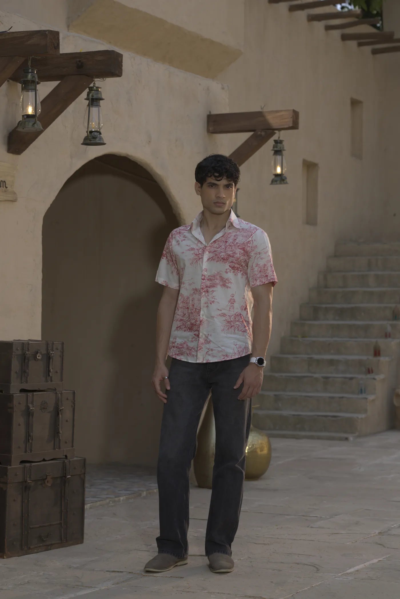
Rouge VoyagePrinted shirt, full length 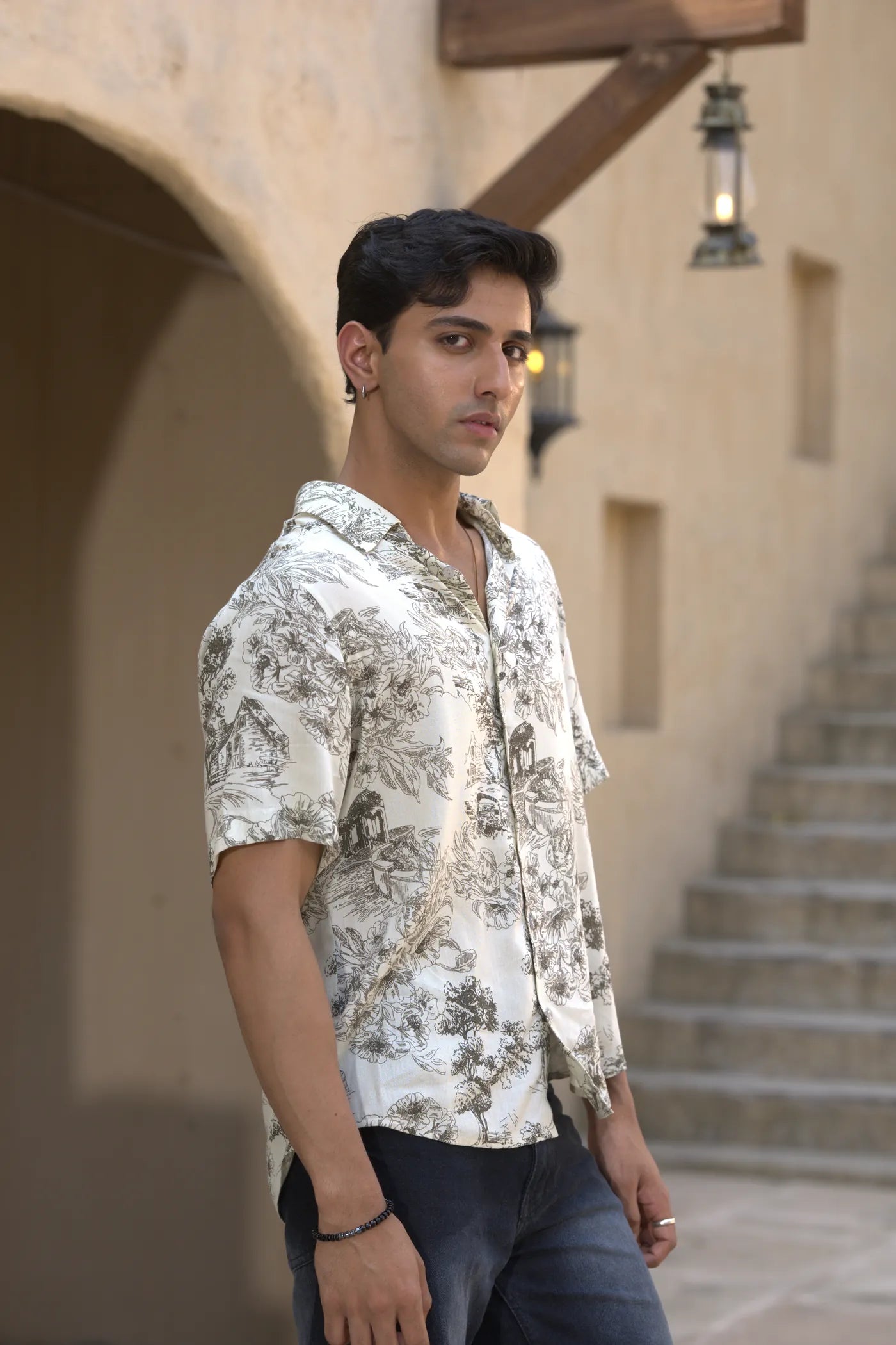
Sketchbook IvoryPrinted shirt, three-quarter 
Sketchbook IvoryPrinted shirt, print detail


Selected product directions. The photography covers two printed shirts supplied by the brand. The drops show the collection structure. Neither is the full catalogue.
06 / Shopify implementation
The storefront, shown as a system.
Built on Shopify and styled to the brand. The design was agreed before development began.
Brand system
Cream, black and maroon, with large editorial type and photography.
Collection system
Six drops grouped under Men and Women, each with its own line.
Product discovery
A header, collections and a product layout designed for browsing.
Shopify build
Product, collection and checkout pages come from Shopify. The theme was customised for 1209 Studios.
Responsive experience
Layouts designed to stack to one column on small screens.
Design prototype
Illustrations of the designed layouts. Not store screenshots.
From product to cart
- ProductPhotography leads
- CollectionBrowse by drop
- Product pageGallery and sizes
- CartBag, then checkout
Collection browsing
A photograph-led grid with Men and Women filters.
Design prototype

Product detail view
A large image with extra views, size options and an add to bag button.
Design prototypeResponsive layout
Three columns on desktop become one stacked column on a phone.
Design prototypeShopping-flow cue
A bag drawer lists the items and leads to Shopify checkout.
Design prototypeNavigation and discovery
Header
- New arrivals
- Men
- Mehfil
- Virasat
- Untamed
- Women
- Noor
- Kashish
- Fearless
- Drops
Editorial to commerce
- Wear both. heroShop the drop
- Six drops, one identityDrop collections
- Cultural fluidity bannerShop Women, Shop Men
- Be first to the next dropNewsletter sign-up
EditorialCommerce
This case study describes the storefront design and build. It does not cover apps, integrations, analytics or results.
07 / Mobile experience
Designed for small screens.
These mobile layouts come from the design prototype. They show how the storefront was designed to work on a phone. They are not device screenshots.
Menu
Men and Women open as an accordion that lists their drops.
Rows
Related products and quick size choices sit in swipeable rows.
Layout
Editorial sections stack into a single column on small screens.
Illustration of the designed mobile menu. Not a device screenshot.
Start a project
Planning a custom Shopify website?
If you are building a fashion or product-led storefront, tell us what you have in mind and we will talk it through.
Start a conversation