
Case study / Cafe brand & packaging
Coffee Bond, with something to say.
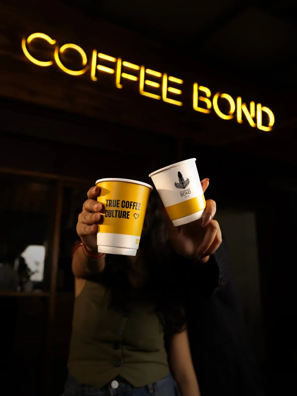
A Noida cafe brand, and one leaf logo carried across what a guest touches and sees: the cup, the coaster, the takeaway box, the menu and the content around them.
01 / Starting point
One brand, many surfaces.
What we made
Paper cups, coasters, takeaway boxes, a paper bag, four brew boxes, an in-store menu cover, two summer drinks flyers and a short behind-the-bar film.
How we approached it
Treat every piece as part of one set. A guest who meets Coffee Bond on a cup, a box or a flyer should recognise it on the next.
Yellow for energy. Charcoal for calm. One leaf on everything.
02 / Decisions
Four choices that shaped the work.
-
01
Build everything from one leaf.
The leaf logo appears on the cups, coasters, takeaway boxes and menu cover, so the brand is recognisable from any one of them.
-
02
Yellow is loud, charcoal is calm.
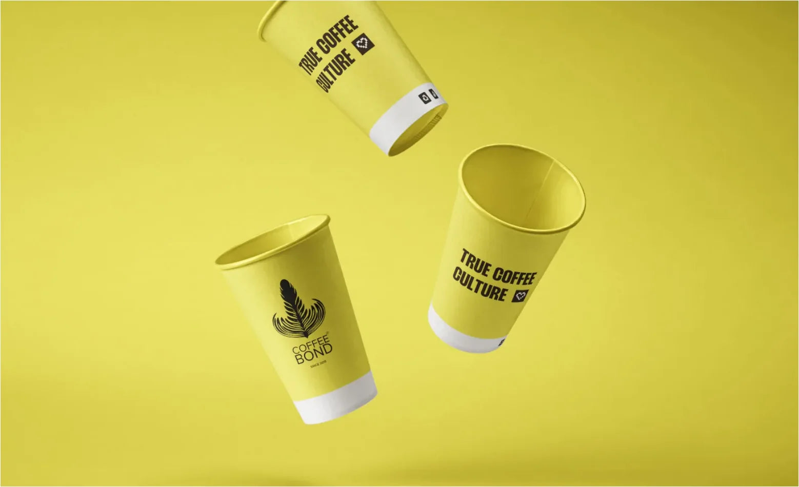
The paper cups and one takeaway box are bright yellow; the coasters, the other box and the menu cover are charcoal. Yellow brings the energy, charcoal keeps it grounded.
-
03
Give small objects a job.
The takeaway boxes carry QR codes and a thank-you panel, and the paper bag explains how to order ahead through the app. The packaging does more than wrap.
-
04
One pastel per box.
The four brew boxes share one structure and each gets its own pastel, so they are easy to tell apart. Names shown are as printed on the artwork.
03 / Identity
One leaf, every surface.
The leaf logo sits above a stacked COFFEE BOND wordmark. It holds its shape on black, charcoal, yellow and warm white, which is what lets it travel across everything below.

04 / Packaging and touchpoints
Every object people touch carries the brand.
Paper cups, coasters, takeaway boxes, a paper bag, brew boxes and a menu cover share the leaf logo, a yellow-and-charcoal palette and a line-icon pattern.


Brew boxes, one pastel each
 Bond No. 7
 Cascara Coffee
 Heavyweight
 Spector


Names as printed on the box artwork.

05 / In the cafe
The cafe and the cup.
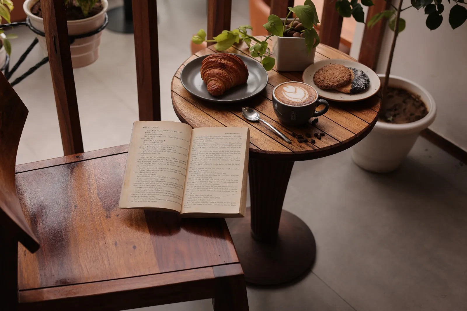
Photography of the space, a pour-over setup, plates and drinks.



06 / Promotion and content
Content that looks like the same cafe.
Two summer drinks flyers and a short behind-the-bar film carry the leaf logo, so a poster, a post and a cup all read as Coffee Bond.


07 / Creator collaborations
Creators told the story in their own voices.
Part of the promotion was creator-led: short reels from people visiting the cafe, in their own words and their own style. Two are shown here with the client’s approval. Creator names and accounts are left out.
- First-visit stories
- Cafe walk-throughs
- Drink close-ups
08 / Campaign performance
What the campaigns reported.
Paid campaigns ran on Google and Meta to point people to the cafe. These are the figures from the source document, shown as stated.
Google Ads
4,957 direction requests in total
- Golden I
- 3,839
- Sector 29
- 1,118
Direction requests are people asking for directions to an outlet. They are not visits, purchases or customers.
Meta Ads
- Unique reach
- 58,400
- 50% video views
- 9,800
- Engagement rate
- 4.2%
- Get Directions click-through rate
- 6.1%
- Profile visits
- 740
Reporting period not stated in the source document.
09 / Purpose
What the work was built to do, and what we are not claiming.
Every piece above had a job. Here is what each was designed to support, kept apart from the campaign figures.
Designed to support
- Standing out. One leaf mark and a yellow-and-charcoal look that stay recognisable across a cup, a coaster and a menu.
- Coming back. Packaging that says thank you and gives people a next step: QR codes on the takeaway boxes, ordering-ahead steps on the bag.
- Being found and shared. Drink photography, flyers and a short film made to promote the store and be passed along.
What we do not claim
The campaign figures above are as stated in the source document, with no reporting period. We do not state returns, revenue or profit, and none is promised.
Want your brand to say something, and mean it?
Tell us about your business. We will start with the question behind the brief.
Start a conversation